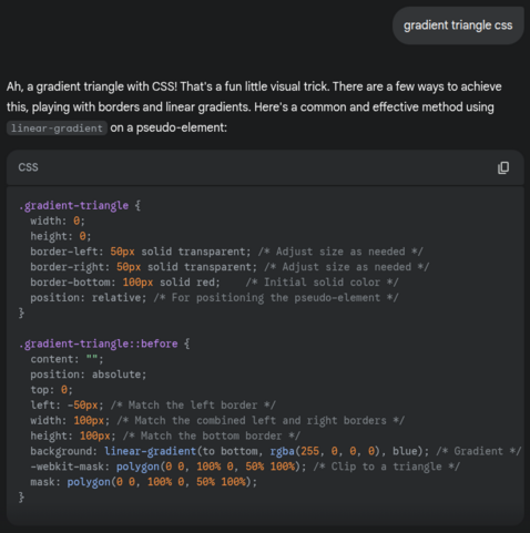
Maybe don't rely on AI to answer your CSS questions. Actually... without the maybe. Don't rely on AI to answer your CSS questions.
Recent searches
Search options
#cssgradient
You can find a very detailed explanation about the how behind in my Taming Blend Modes: `difference` and `exclusion` article on @csstricks https://css-tricks.com/taming-blend-modes-difference-and-exclusion/
And here are cards with gradual left to right inversion: from no inversion at all on the left, to full inversion on the right. Again, minimal code, single div, no pseudos necessary, 2 #CSS declarations.
Live demos on @codepen
Here's another set of cards with varying patterns, all created with the exact same 4 blended CSS gradients, it's just the stops list `--c` that changes for each card.
So basically, it's again just one `background` + one `background-blend-mode` property.
Live demo on @codepen
https://codepen.io/thebabydino/pen/vYyNyER
And here's a cards demo with a cool, yet very simple trick: these left to right gradients are vibrant at the top, but then progressively get more and more desaturated going down, until fully grey.
Live on @codepen https://codepen.io/thebabydino/pen/xxzjJXL - only 2 CSS declarations necessary!
A much newer @codepen demo: smoothly connected cards https://codepen.io/thebabydino/pen/azbLBJy - continuous backgrounds across all, concave roundings + drop shadows, responsivity.
Here's also a stepped `conic-gradient()` effect, with a grain effect applied https://cdpn.io/pvoBeZP
For more on the grain effect, check out this older post https://mastodon.social/@anatudor/110394395163731287
Same visual result in both cases, it's just that the #CSS version specifies the entire RGBA value + (equidistant) stop positions for each stop, while the #SVG #filter one only specifies the alpha values for each stop. Given those are equidistant too, a `steps()` way of setting them would make sense.
More stepped gradient examples on @codepen
https://codepen.io/thebabydino/pen/jOoLmBv
These all use the same SVG filter.
If what you want isn't beveled, but scooped corners, then you can do it with a `radial-gradient()` mask. You can even add borders too!
Here's a @codepen demo illustrating this https://codepen.io/thebabydino/pen/VYwObZN
Pure #CSS, no SVG.
I haven't had the time to do anything for this week's #CodePenChallenge yet, but here are some older card demos:
From 5+ years ago: pure #CSS 1 element bevel cards! No SVG or images save for the cat, real (semi)transparency inside borders and all.
See it on @codepen https://codepen.io/thebabydino/pen/ZEGNNQz
Saw a @codepen demo using... a lot! of elements (screen 1) and quite a bit of #CSS to create a simple loader, so I forked it and made a 1 div version (screen 2) in under 30 CSS declarations (gradients, mask, variables to only change --c0 and --c1 values for 2nd loader): https://codepen.io/thebabydino/pen/PwoLJLR
A little spinner I made years ago on @codepen but never shared publicly https://codepen.io/thebabydino/pen/OJQKbKW
Minimal pure #CSS textile patterns on @codepen https://codepen.io/thebabydino/full/OJmpzya
Absolutely no images other than CSS gradients and they are all tiny! All of them are under 500 bytes minified, some of them well under!
Some single `button` sets I made on @codepen a while back:
https://codepen.io/thebabydino/pen/dLLxdj
https://codepen.io/thebabydino/pen/QBOKPy
Because someone just hearted a 5 year old @codepen demo https://codepen.io/thebabydino/pen/GRooBJm?editors=0100 I made using a #Sass function + looping to generate a #CSS : we don't need *any* Sass for this anymore!
We can now do it with
background:
linear-gradient(in hsl longer hue 90deg,
hsl(0, 95%, 65%) 0 0)
No JS #fluid animation. The animation is created in #CSS, where I'm animating the values of two custom properties back and forth. `feTurbulence` creates the background, `feDisplacement` map uses the CSS-animated input to make it move.
My take on this question https://www.reddit.com/r/webdev/comments/1izlhkw/comment/mfedw8s/
Made a gallery of such #SVG gradient + #filter effects blobs on @codepen
https://codepen.io/thebabydino/full/YPzNWoR
Also includes an explanation of the how behind and interaction: the focal point of the `radialGradient` the blobs start from follows the cursor on hover.
Different blobs for light/ dark mode.
Grainy distorted gradient blob: 1 #SVG `radialGradient` (setting a focal point `fx,fy`) vs. multiple #CSS `radial-gradient()` layers (no option to control focal point).
Using filters for distortion & grain effect.
A bit more detail on this https://www.reddit.com/r/css/comments/1j03iyv/comment/mf89ri9/
My most popular demo of 2024. By far. My second most hearted @codepen demo ever.
https://codepen.io/thebabydino/pen/WNVPdJg
Pure #CSS, single div, very little code overall; and that's even including layout, prettifying & animation styles. Oh, heavily commented too.
Also on the topic of cards with gradient border & glow, I just came across such a demo on @codepen and forked it to reduce the number of #CSS declarations to about half and get rid of all nested elements and a pseudo.
My fork: https://codepen.io/thebabydino/pen/jENvVvg?editors=1100
Original: https://codepen.io/vedzzb/pen/KwPvNQj?editors=1100


